Device previews
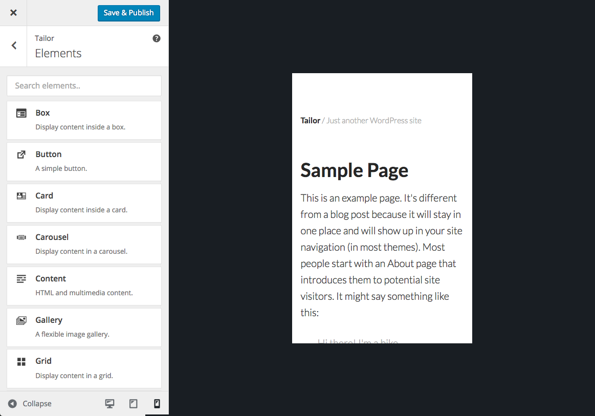
The latest version of the Tailor page builder for WordPress (1.1.3) aligns the device preview and media query functionality of the plugin with that of the WordPress Customizer.
Device previews
Choose from one of three device sizes to preview your page in that size:
- Desktop
- Tablet
- Mobile

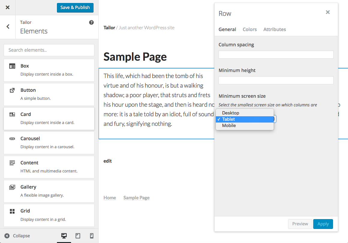
Responsive settings
These sizes are now also used in the settings for certain elements. For example, you can specify the minimum screen size that columns within a row should be displayed as columns (instead of being stacked on top of one another).
